
Web/UX/UI
Illustration
Design
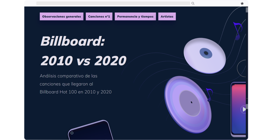
Billboard Hot-100: a comparative analysis, 2010 vs 2020.
I made a website with the results of my short data analysis project.
2021
Personal Project
Check out the code I used to analyze this data.
🌟 The project
I started a short project comparing the most popular songs of 2020 and 2010 to learn data analysis in Python and improve my data visualization skills.
✈️ The process
I performed all the tasks in this project, from design and illustration to data analysis and data cleaning in Python.
To build the database, I merged two Kaggle datasets, one with data from Spotify, containing general information about the songs: release date, rating as explicit, duration, etc.; and the other with all the Billboard entries by date with rank. I used the Pandas library to analyze and Plotly for the visualizations.
The data
As soon as I started examining the data, the differences between the two years became clear: not only were there more artists and more songs making it into the Billboard Hot 100 in 2020 but the percentage of explicit songs had also significantly increased.
When I dug deeper, something struck me about the list of songs that had reached number 1. The musical/genre was obvious, but there were now fewer "repeat" artists. The most popular songs were not just Katy Perry or Bruno Mars; there was more variety.
This realization, combined with the reduction in song lengths and more explicit songs in general, seemed to suggest that music distribution channels had driven musical change in the last decade. Streaming vs. radio, greater access to varied artists, less use of censored versions of explicit songs, internet trends that had put songs from several years earlier back on the chart...radio seemed to have lost ground as the trend-setting metronome.

So I decided to focus my analysis on these change indicators: music genres, duration, number of artists, number of weeks in the rank per song, etc.


To analyze the changes in the most popular music genres in the chart, I decided to focus exclusively on the songs that had reached number one. Getting accurate genre data for all the songs in the chart proved too difficult, so I decided to limit my analysis. From this list of number 1 hits, I manually logged the genres and sub-genres of each song from Wikipedia. I considered the following to be the main (or "parent") genres:

I considered two main genres for each sub-genre as "parents." For example, in the case of dance-pop (a subgenre with influences from pop and electronic music, often house music), its parents were Pop and EDM. Each song had between one and three subgenres on Wikipedia, so I classified each into their respective genres/sub-genres.

I limited the parents to only two genres to keep the analysis simple. I also included disco and funk in the R&B category and any electronic music in the EDM.


Other interesting observations included: the number of weeks in the chart per song, artists per song, artists in both decades, etc. One interesting observation I didn't include on the final website is the relationship between the date of first appearance on Billboard vs. the date of the highest ranking. I didn't include it in this analysis version because I want to dig deeper into it. However, at a glance, it is evident that in 2020 the songs reached their best position in much less time than in 2010.
The structure
After analyzing the data, I presented it on a simple web page, with SVG graphics and visualizations, for practicality. The Plotly visualization library includes a function to export the graphics in SVG, so I based it on that to create the visualizations.
To organize my ideas on how to present the analysis, I made a Wireframe. I wanted the data to tell a story, to follow a logical line. I organized it that way.

The wireframe helped me realize something of utmost importance: it was necessary to adapt each graphic or data visualization graph to three different sizes (desktop, tablet, and mobile) to be appreciated well. Perhaps the biggest disadvantage of doing this project with SVG and not with a library like D3 is that SVG is not responsive. As soon as I exported the graphics as HTML from Plotly I also realized that if I wanted to use them as HTML, they would require a lot of customization and code to make them look the way I wanted. So, in the end, I opted to adapt the graphs myself to three different sizes.
I chose three specific dimensions that best suited the different types of visualizations.

I already had the analysis and the plots/graphs adapted. I wanted to create a one-page site to host this project and its future.
I started looking for references for the most "tangible" part of the project, the web. I've always liked the aesthetics of virtual instruments or VST; they have a charm that is old-fashioned and avant-garde simultaneously, like a nineties idea of futurism.

Initially, I wanted to create something with a similar feel. The underlying theme of the analysis - how the shift towards streaming is trending in the structure and shape of popular music today - seemed to resonate quite well with this style.
However, the first concepts I made with this idea did not convince me.


Perhaps what made this aesthetic fit so well with VSTS is that the very concept of a virtual instrument is quite retro-futuristic. And the fact is also that the overloaded interfaces full of knobs and audio waveforms that are so common in virtual instruments exist because the very functionality of the virtual instrument warrants it. It looks cluttered, but in the end, every element of that interface serves an important function.
I didn't want to abandon the concept entirely but wanted to modify it. I still wanted the website to have a dark interface with contrasting vibrant colors. Without going too far from the music sphere, Spotify had this visual identity that caught my attention.

I decided to bite the bullet and try modifying what I had already done. Maybe a little less cluttered, maybe a lesser amount of different shades of grey. I already had in mind the colors I'd use to differentiate 2010 and 2020, so I started from them to generate more components.

Cards were the main building block for this UI. Apart from graphics and visualizations, all the important information would be contained within cards. I didn't want to use a lot of text on the website (that's why I expanded on it here), so the cards were my raw material to build the site.
I decided to clean them of all unnecessary elements, lines, shadows, etc., and use mainly text and color. I differentiated the cards with colors by year to make the data reading easier.

By cleaning up the UI elements, I devised a concept I liked. From the wireframe, I rebuilt each component to its cleanest version.


I wanted there to be a lot of contrast. Between the background and the text, the data and the background, the cards of one year versus another. The typographic scale also had to be contrasting. It's a comparison, an analysis that puts two moments in time, one versus the other, so I decided to emphasize that contrast.
For the typographic scale, I used a slightly modified version of 1.4 (rounded down instead of up) to ensure high contrast between the titles and the body. I set the titles in black or bold to further emphasize this contrast.

One of the most complicated sections to design was the music genres part. In the wireframe, I had planned to have information from both years side by side and separate them by borders. I wanted the user to be able to compare the two states in one place to see how the distribution of each genre had moved.
In my mission to clean up the whole UI, I thought I'd eliminate that concept and put each graphic/card one after another, interspersing years. But it wasn't working. It didn't have the same punch. Obviously, this layout was only possible on pc, tablet, or mobile would be too small for it. Ultimately, I kept the idea of having them together, but I added badges to differentiate the year and used blurred color shadows instead of solid borders.

The most difficult task was actually adapting the visualizations to the graphic style of the site. I wanted to be as accurate as possible with the data, but there were visualizations that were simply not pleasant to read (like the one below, right). I had to decide when to cut non-essential information and what to keep in each plot.

Finally, I made some decorative illustrations to break down the introduction and make it easier to read. I also made an illustration for the header.

I developed the site in HTML and CSS using a modified version of Bootstrap with SASS. The final site is live at here (through Netlify)
Final website →