Illustration
Illustrations for Get on Board
Illustrations and illustration system for Get on Board

2022 - 2023
Get on Board
🌟 The Project and Objectives
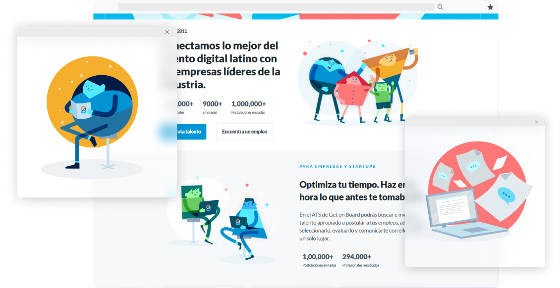
To complement the Get on Board brand, an illustration style was needed that represented humanity without limiting it to specific physical features. To achieve this, I created an illustration style based on geometric shapes with shadows, reflecting the overlapping elements in the Get on Board logo.

💡 Components
Colors
I used a color palette based on the Get on Board brand colors but extended with various shades of each color to get more color combinations in the illustrations.

Regarding the color palette for the characters, typically, each character would be assigned a primary color, and various shades of that color would be used for different parts of the character's design.

Backgrounds
The backgrounds consist of solid colors with floating elements such as stars, lines, dots, or specific objects, encapsulating or framing the illustrations.

The elements in the background can be stars, lines, dots, or even more specific objects.

Objects

Objects complement the action in an illustration and often float around the characters. They are kept within the color palette.
Not all illustrations feature characters. In those without characters, the main focus is on a central object surrounded by secondary objects of lesser importance.

UI Elements
To represent the Get on Board platform, I utilized simplified versions of the platform's UI, incorporating perspective into the illustrations.

Composition
Most of the illustrations are focused on a character, with all the other elements "floating" around them. The character steps out from the boundaries of the background and takes center stage.

🚀 Uses

Throughout 2022-2023, I created an illustration bank with over 60 items and a component system to create new illustrations more efficiently. These illustrations have been strategically implemented in various touchpoints such as newsletters, podcast covers, websites, and stickers. They aim to strengthen the brand's visual identity and convey the connection between the company and the human dimension.

🧠 Key Learnings
In this project, I understood the effectiveness of using primitive geometric shapes to represent humanity in an inclusive manner. Additionally, I recognized the importance of using these illustrations consistently across all communication channels, ensuring a strong and consistent brand image.

