
Design
Hecho por Humanos: Get on Board's podcast
I created the identity of "Hecho por Humanos", Get on Board's poscast.
2022
Get on Board
🎁 What is Hecho por Humanos? - The Product
"Hecho por Humanos" (Made by Humans) is a podcast by Get on Board that delves into the human dimension behind creating systems, tools, and technological platforms. Recognizing that technology is made by and for people, this podcast aims to answer fundamental questions: How do we organize, grow, and adapt to drive these innovations forward?
🌟 The project
The central concept of the podcast is the union between technology and humanity. Through each episode, we explore how people organize, grow, and adapt to create and develop technological systems, highlighting the importance of the human dimension in this process.
To create the visual identity for "Hecho por Humanos," I sought to establish a unique visual language that, while related to the Get on Board brand, has its own independent identity and reflects the podcast concept.
Goals
The main objective of the project was:
- Create a visual identity for the podcast that embodies Get on Board's essence and concept.
🎨 The brand
Identity

During the creation process, the "Hecho por Humanos" logo underwent several iterations and refinements to ensure it effectively captured the essence of the podcast. Tests and adjustments were made in the design with the aim of visually conveying the interaction between technology and humanity.


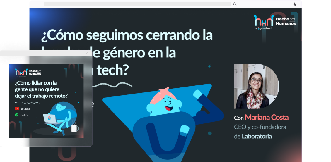
The final visual identity of "Hecho por Humanos" consists of several elements that reflect its purpose and message. The distinctive logo features two letters, "h" (one reversed), with an "x" in the center. These letters not only represent the brand name (Hecho por Humanos) but also symbolize two chairs and a table, alluding to the act of conversation and collaboration.
Regarding typography, I used a combination of Archivo Black for highlighting the podcast name and Archivo Light Underlined for supporting text. I established four main text types for additional texts.

Colors
Originally, versions were designed in light and dark modes, but with usage and feedback, it became evident that the dark color scheme was more than sufficient to convey the brand's identity.
The colors used in the visual identity of "Hecho por Humanos" are a variation of Get on Board's main colors, modified to fit a darker palette.

Decorative Elements
To add dynamism and visual depth, I used gradients as decorative elements. There are two gradient colors, blue and red, and both should blend into the background at the edges to achieve a harmonious visual effect.

In addition, faded 1s and 0s were incorporated as decorative elements, referencing both binary code and the "hxh" logo. These elements help reinforce the connection between technology and humanity and are subtly integrated.

To add a greater sense of "humanity" to the brand, doodles were incorporated as decorative elements in the design of "Hecho por Humanos." These doodles bring a creative and playful touch, adding a distinctive visual element and representing the connection between technology and humanity.


Illustrations
Further down the podcast's life cycle, we included the illustrations I created for Get on Board in Hecho por Humanos brand. These illustrations feature geometric characters but with a clear human representation. These illustrations reinforce the podcast's focus on the intersection between technology and people by combining abstract elements and recognizable shapes.


Photography
People's photography plays a crucial role in the visual identity of "Hecho por Humanos." We used images of podcast guests to capture the diversity and human connection underlying the program's central theme. These photographs convey the message that technology is created by and for people, highlighting the importance of the human dimension in the technological world.
Additionally, all photos are framed in a curved shape to give an organic flow to the visual element. This design decision creates a sense of harmony and smoothness, reinforcing that the "Hecho por Humanos" podcast focuses on human interaction and the relationship between people and technology.

🧠 Key Learnings
In summary, during the branding project for "Hecho por Humanos," I understood the importance of having a clear brand essence, finding the balance between visual independence and connection, paying attention to details, using effective visual elements, and maintaining a mindset of adaptability and continuous learning. These learnings allowed me to develop a solid and cohesive visual identity for the podcast, conveying its central message of the relationship between technology and humanity.