
Web/UX/UI
Design
Illustration
Insights Pro Landing
New landing for Insights Pro, a powerful hiring analysis tool. Updated look & feel with fresh visuals, simplified data, new illustrations, and Haml/Ruby implementation.
2023
Get on Board
🎁 What is Insights Pro? - The Product
Insights Pro is a powerful and comprehensive tool developed by Get on Board that provides companies with detailed analysis and in-depth statistics on the jobs posted on its platform. Its main objective is to help organizations optimize their recruitment strategy by providing valuable and insightful information on job performance.
🌟 The Project
We faced the challenge of updating Insights Pro's visual identity to reflect the brand's values and personality more accurately. This involved a complete redesign of the look & feel, including a new color palette, presentation of information, and visual elements.

In addition, we sought to unify Insights Pro's web presence into a single landing within the Get on Board website. During the initial launch phase, we created several landings using technologies such as Webflow and Netlify + 11ty to iterate on content quickly. However, with a clearer narrative and a more established vision for the product, it was time to sort and unify everything into a cohesive, centralized experience.
Goals
The project objectives were:
- Design a new look & feel that reflected the brand's intention and values.
- Update the design of the Insights Pro landing page with a fresh and renewed approach.
- Unify the product's web presence into a single landing page within the Get on Board website.
☀️ The Design: Full renovation
Look & Feel
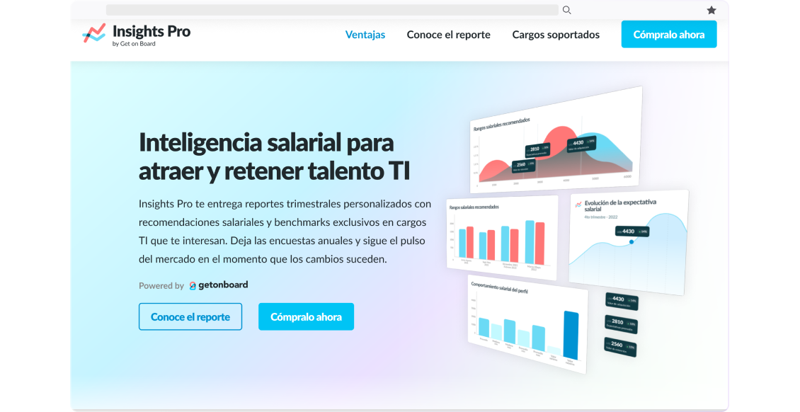
The biggest change I made to the product's visual identity was the color palette, transitioning from a dark scheme to a light scheme, aiming to give it a lighter and refreshing appearance. New colors were incorporated, such as purple and light green, complementing Get on Board's blue and red colors.

To achieve a modern look, subtle gradients were used in all landing page sections. The main, more eye-catching gradient is found in the header and footer, while other gradients define the different sections of the landing page, providing a consistent visual experience.

I also created new illustrations to reflect the brand's values as part of the product's visual identity update.

I used perspective and shadows for the new illustrations to give a sense of depth. These illustrations provide a unique visual touch to the landing page and help convey key messages in an appealing way.
The most important element of this new landing page was the section that explained the report in more detail. For this section, I reinterpreted and simplified the report's graphics to make them easy to understand. I made adjustments to the data presentation to highlight key points.

Site structure and functionality
The landing page offers three key actions focused on selling the product. In short, users can choose to "Contact Sales," "Get a Sample Report," to experience the product firsthand, or "Check Available Profiles" within a pre-made pack or explore all available profiles for a customized pack.

Contact Sales: Selecting "Contact Sales" opens a form where users can fill in their contact information. This option triggers a series of sales emails designed to engage and assist potential customers. This is the more direct approach to sales.

Get Sample Report: Also represented by a "Find out More" button in the header, opting for the "Get Sample Report" action triggers an email containing a link to access a sample report. This is meant for users who want to experience the product firsthand. The sample report is followed by a sales email sequence providing additional information.

The sample report also includes a banner encouraging users to purchase the full Insights Pro product.

Check Available Profiles: Choosing "Check Available Profiles" opens a pop-up displaying the profiles available within any of the 5 pre-made packs. Each pack has a description and profile list catered to the most common business needs of the user.


Additionally, there's an option for a 6th "Custom pack", where users can choose their personalized profiles. This pack card is highlighted using a different gradient background and color button, and its pop-up displays all 46 main profiles available (without seniority, 125 total, including different seniorities)

Each profile pop-up includes a button that contacts the user with sales, the same sequence as in the "Contact sales" action. The main difference here is this action includes the user-preferred pack information.
💻 Implementation
Implementing the new design was directly done in the codebase using Haml and Ruby. As the front-end, I implemented the landing page design while collaborating with other developers to add the necessary functionality to the lead forms.
View final design (screenshot) ↓ View final website (live) →

🧠 Key Learnings
During this project, I gained valuable knowledge in various areas. I learned how to efficiently manage the update of a landing page, from adapting the visual identity to incorporating new graphic elements. Additionally, I had the opportunity to work directly in the codebase, which allowed me to improve my skills in Haml and Ruby. I also gained experience creating custom illustrations and implementing responsive design, contributing to my professional development.