
Web/UX/UI
Design
Insights Pro Report design + sample report landing
I used D3, 11ty, and Netlify to create and design an appealing landing page+sample report for Insights Pro, a powerful tool by Get on Board offering detailed job analysis and statistics.
2022 - 2023
Get on Board
Demo site (landing)
🎁 What is Insights Pro? - The Product
Insights Pro is a powerful tool developed by Get on Board that provides detailed analysis and statistics on jobs posted on their platform. It aims to help companies gather valuable information about job effectiveness and make strategic decisions to improve their outcomes.
🌟 The Project
A public and navigable version of the report known as the "Sample Report" was needed to promote Insights Pro. The main goal was to share the product with users in a visual and accessible way, leading to the integration of the Sample Report and landing page into a single website.
Goals
The key objectives of the project were:
- Create a public Sample Report: Develop a version of the report that could be shared with potential clients, demonstrating the benefits and capabilities of Insights Pro.
- Design an appealing landing page: Create a landing page that includes the Sample Report, relevant information, and contact details for marketing and sales campaigns.
- Maintain agility in editing and iteration: The landing page needed to be easily editable and allow for quick changes to adapt to evolving market needs and user demands.
☀️ The process
The landing: Technology and UX Challenges
The challenge was to iterate rapidly and constantly test new content. To overcome this, I implemented the landing page using 11ty, a static web generator, allowing quick changes and deployments from a separate repository connected to Netlify. I used Nunjucks for templating and JavaScript for functionality.
One of the most significant technical challenges was finding an effective solution to capture leads from the landing page.

From a UX perspective, we aimed to maintain a user experience similar to Get on Board. I implemented pop-ups to collect contact information from interested users. This aspect of the project went through several iterations, starting with an external form connected to automation through Zapier and eventually using Get on Board's internal form system for lead collection.
We experimented with strategies such as making the report visible only after users filled in their information or including a link to a webinar explaining the product in a follow-up email sequence. Ultimately, we fully internalized the landing page into another project to improve lead management.
In terms of content, as the project progressed, we added a longer and more in-depth explanation of the product, its features, and its variants. We experimented with different ways of displaying this information and got closer to the goal with each iteration.
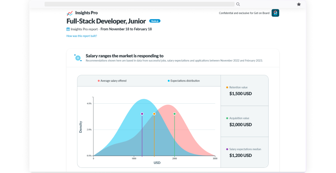
Generating Dynamic Charts and Enhancing the Experience
Before creating this landing page, the Sample Report only existed in structure. I developed dynamic charts using the D3 JavaScript library to bring the report to life. These charts were generated from CSV files extracted from Get on Board's data, allowing for a visually appealing and understandable representation of real information. The D3 charts were also implemented in the report's final version within the codebase, with improved presentation and analytical capabilities.

I made sure that the graphics reflected both the Get on Board identity and the Insights Pro concept.


In terms of design and structure, we strived for a clear and consistent presentation of information on the sample report. We established distinct sections to provide a seamless and engaging user experience. Furthermore, we ensured that the Sample Report's most relevant information and key points were highlighted, using visual elements such as icons and charts to effectively convey data and statistics.

🧠 Key Learnings
Throughout this project, I gained valuable insights into content management, technology integration, and user experience design. I learned to leverage tools like 11ty, D3, and Netlify to create a dynamic and functional website and implement effective lead-capture strategies. I also developed skills in interpreting and visually presenting data, using charts and visual elements to convey information clearly and concisely.